Power BI Governance, Good Practices, Part 2: Version Control with OneDrive, Teams and SharePoint Online

Power BI Governance, Version Control with OneDrive for Business, Microsoft Teams and SharePoint Online

One of the most important aspects of the software development life cycle is to have control over different versions of a solution, especially in a project where there is more than one developer involved in the implementation. Just like when you normally create a project in visual studio and you commit the changes back to a source control system like GitHub or Azure DevOps, it’s advised to keep the history of different versions of your Power BI reports. What we expect from a source control solution is to keep tracking of all changes happening in the source code while developing a project. So you can easily roll back to a previous state if you like to. 

The other benefit of having a source control process in place is when multiple developers are working on a single project. Every single one of them makes changes in the source code then they commit all the changes into the source control server without overwriting each others’ work. 

With Power BI things are a bit different though. Power BI report files are PBIX files which are stored in binary format (well, PBIX is basically a zip file isn’t it?) which at the time of writing this post, there is no official way to enforce Power BI source control in any source control solutions like GitHub or Azure DevOps (YET). 

Microsoft announced a fantastic feature last week (6/05/2020) named “Deployment Pipelines” which does exactly what we’re after, but it is currently a preview feature which is only available only to organisations with Power BI Premium. So it is out of the game for the majority of us.

Having said that, there is still a way to keep history of changes in the shape of different versions of PBIX files. This is called Version Control.

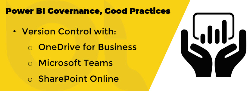
There are several ways you can enable version control over your PBIX files while developing the report. Regardless of the version control platform you need to think about having multiple environments and who can access them for doing what.

EnvironmentAccessible toDescription
DevelopmentDevelopersData modellers and report writers access this environment for development purposes.  
User Acceptance Test (UAT)Developers, SMEs, Technical Leads, Power BI AdminsAfter the development is finished the developers deploy the solution to the UAT environment. The solution will then be tested by SMEs (Subject Matter Experts) to make sure the business requirements are met.
Pre-prod (Optional but recommended)Technical Leads, Power BI AdminsAfter the solution passed all UAT testing scenarios Technical Leads or Power BI Admins will deploy it to Pre-prod for final checks to make sure all data sources are correctly pointing to production data sources and all reports and dashboards are working as expected.  
ProductionTechnical Leads, Power BI Admins, End UsersAfter pre-prod checks completed Technical Leads or Power BI Admins deploy the solution to the Production environment which is then available to the end users.

Version Control Options

If your organisation does not have a Premium capacity then “Deployment Pipelines” feature is not available to you. So you need to come up with a solution though. In this section I name some Version Control options available to you

  • OneDrive for Business
  • Microsoft Teams/SharePoint Online
Continue reading “Power BI Governance, Good Practices, Part 2: Version Control with OneDrive, Teams and SharePoint Online”

Highlighting Below Avg Sales per Hierarchy Level with SWITCH() and ISINSCOPE() DAX Functions in Power BI

Highlighting Below Avg Sales per Hierarchy Level with SWITCH() and ISINSCOPE() DAX Functions in Power BI

I was working on a project a wee bit ago that the customer had conditional formatting requirement on a Column Chart.
They wanted to format the columns in the chart conditionally based on the average value based on the level of hierarchy you are at.
Here is the scenario, I have a Calendar hierarchy as below:

  • Calendar Hierarchy:
    • Year
    • Semester
    • Quarter
    • Month
    • Day

I use “Adventure Works DW2017, Internet Sales” Excel as my source in Power BI Desktop. If I want to visualise “Total Sales” over the above “Calendar Hierarchy” I get something like this:

Line Chart in Power BI, Total Sales by Year

Now I activate “Average Line” from “Analytics” tab of the Line chart.

Adding Average Line to Line Chart in Power BI

When I drill down in the line chart the Average line shows the average of that particular hierarchy level that I am in. This is quite cool that I get the average base on the level that I’m in code free.

Power BI, Drilling Donw in Line Chart

Easy, right?

Now, the requirement is to show the above behaviour in a “Column Chart” (yes! visualising time series with column chart, that’s what the customer wants) and highlight the columns with values below average amount in Orange and leave the rest in default theme colour.

So, I need to create Measures to conditionally format the column chart. I also need to add a bit of intelligent in the measures to:

  • Detect which hierarchy level I am in
  • Calculate the average of sales for that particular hierarchy level
  • Change the colour of the columns that are below the average amount

Let’s get it done!

Detecting Hierarchy Level with ISINSCOPE() DAX Function

Microsoft introduced ISINSCOPE() DAX function in the November 2018 release of Power BI Desktop. Soon after the announcement “Kasper de Jonge” wrote a concise blogpost about it.

So I try to keep it as simple as possible. Here is how is works, the ISINSCOPE() function returns “True” when a specified column is in a level of a hierarchy. As stated earlier, we have a “Calendar Hierarchy” including the following 5 levels:

  • Year
  • Semester
  • Quarter
  • Month
  • Day

So, to determine if we are in each of the above hierarchy levels we just need to create DAX measures like below:

ISINSCOPE Year		=	ISINSCOPE('Date'[Year])
ISINSCOPE Semester	=	ISINSCOPE('Date'[Semester])
ISINSCOPE Quarter	=	ISINSCOPE('Date'[Quarter])
ISINSCOPE Month		=	ISINSCOPE('Date'[Month])
ISINSCOPE Day		=	ISINSCOPE('Date'[Day])

Now let’s do an easy experiment.

  • Put a Matrix on the canvas
  • Put the “Calendar Hierarchy” to “Rows”
  • Put the above measures in “Values”
Detecting Year, Semester, Quarter, Month and Day hierarchy levels with ISINSCOPE in Power BI Desktop

As you see the “ISINSCOPE Year” shows “True” for the “Year” level. Let’s expand to the to the next level and see how the other measures work:

Continue reading “Highlighting Below Avg Sales per Hierarchy Level with SWITCH() and ISINSCOPE() DAX Functions in Power BI”

Visualise SQLite Data in Power BI

SQLite + Power BI

As the name implies, SQLite is a light weight transactional SQL database engine. It is open-source and free for use either for personal commercial. SQLite is widely used in mobile apps and many other desktop applications that need an internal light weight free SQL database. In this post I explain how to visualise SQLite data in Power BI.

Requirements

To be able to go through the process you need to meet the following requirements:

  • Latest Version of Power BI Desktop (Current version: 2.52.4921.682 64-bit (November/2017))
  • Install SQLite ODBC driver: Make sure you install 64 bit version if your Power BI Desktop is 64 bit version like mine!

Note: You may install both x32 and x64 bit versions of the driver if your other applications are in x32 bit.

  • An existing SQLite database

Note: In case you just want to try this and you don’t currently have a SQLite database you can download a SQLite version of “Internet Sales” of AdventrueWorksDW2016 that I made available for you.

How it works

Like any other Power BI cases, it’s really easy to load data from an existing SQLite database to a Power BI Desktop model. You just need to use ODBC data connection and connect to a predefined “ODBC DNS” OR use a “Connection String”. I’ll explain both methods. After you load data to your Power BI Desktop, you create the relationships then you’re good to go and create flashy reports. Continue reading if you’re interested to an step-by-step guide to visualise SQLite data In Power BI.

Importing SQLite Data to Power BI Using ODBC DSN

  • Open the correct version (x32, x64) of ODBC after you downloaded and installed SQLite ODBC Driver
  • Click “Drivers” tab and make sure SQLite ODBC Driver(s) successfully  installed

ODBC Drivers Continue reading “Visualise SQLite Data in Power BI”