This post has been waiting in my blogging list for a while and now this is my last post in 2019. I wish you all have a wonderful year ahead.
In this post I discuss a very important aspect of data visualisation; Colour Coding. I believe, colour coding is one the most powerful and efficient ways to provide proper information to the users. We learnt as human being that the colour can tell a lot about things. For instance, we look at green grass, if it is light green we immediately understand that the grass is quite fresh and healthy. When she gets a bit yellowish, we know that she’s perhaps thirsty. When it gets brown it is probably too late.
Another perfect example is traffic lights. When it is green, everyone is happy, when it is yellow, everyone is racing to pass the junction, well, I’m just kidding, some people tend to pass the yellow light while everyone knows they have to stop when traffic light is yellow right?? And… when it is red, we have to stop. Enough saying about colour coding and its affects on our lives on a day to day basis. Let’s talk about colour coding in Power BI and quickly get to more exciting stuff.
So… colour coding in Power BI, well, we could colour code from the day first that Power BI born, but, perhaps not in a way that I’m going to explain in this post. Conditional formatting is also around for a while now. In this post I show a technique that we can implement in Power BI to use a consistent colour coding across the whole report.
Here is a report without colour coding:

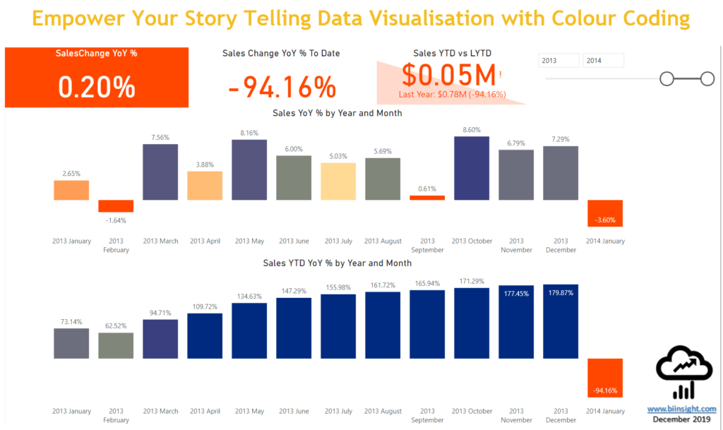
And now look the same report that is colour coded:

Let’s get into it.
Getting Started #
In this technique we’ll follow the steps below:
- We jump online using some awesome free colour palette websites to generate the colours we’d like to use in our reports
- We copy the HEX values and paste into Power BI (via Enter Data)
- We define a range of numbers to identify the ranges that our values will fall into. I personally use percentage, but it might be something else in your case
- We then define some measures to pick a specific colour for the measures we want to colour code
Generating HEX Colours Online #
There are a lot of websites out there that can generate HEX colours for you. Here are my favourite ones:
- Chroma.js Color Palette Helper: You can simply select the kind of palette you’d like to generate (sequential or diverging) and also the number of colour you’d like to generate. You then simply select two or three colours and boom! It generates HEX values of the number of colours you’d like to use in your report. A really powerful feature in Chroma.js is that it experiments the colour palette for being colourblind-safe.
- Colour Gradient Table Generator: While it is not as good and as easy as Chroma.js to use, it has some cool features to offer for free. What you need to do is to enter start and end hexadecimal values of the colours you’d like to create a gradient from. You also need to enter the number of steps you’d like to generate the gradient from, then it quickly generates the values for you. One thing that I found quite useful is that it generated percentages for you, so in my case that I prefer to compare changes in my measures in percentage, having percentages already generated comes handy.
For the sample report file I created for this blog post I used Chrome.js, but, in some other real world projects I sometime happen to use Colour Gradient Table Generator. As always, it depends on the case and what I’m going to do.
Let’s start with generating some colour palettes.
- Browse Chroma.js
- Click “Diverging” for Palette type
- Enter the number of colours (I put 10)
- Enter or select the beginning and ending colours by hovering over the colours
- Make sure the colour palette is colourblind safe
- Now scroll down and copy the HEX colours from the list

Colour Coding in Power BI #
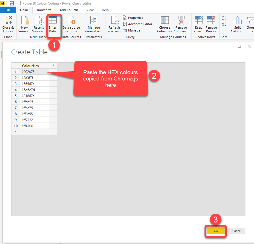
Let’s use the Hex colours in Power BI. We need to paste the copied Hex codes in Power BI Desktop then add some calculated columns that will be used in our conditional formatting. We name the table “ConfigColour”. Follow the steps below to do so.
- Open Power BI Desktop
- Click “Enter Data” and paste the values then click OK
- Now I want to add an “Index” column which I’ll use in a moment in other columns. TO add an index column click “Index Column” drop down from “Add Column” tab then select “From 1”

Now I’d like to add two other columns representing percentage values for each colour. By adding these new columns we can colour code the values as below:

This is good for colour coding the conditions that get undesirable when the numbers grow, like when in a Health and Safety report, the number of incidents grows in compare with the last period. In that case I’d like to show the number of incidents in Red.
Depending on your use case you may want to use the second column to support the opposite situation, like when the number of sales grows in compare with last period sales. Then I’d like to show the sales values in Dark Blue to indicate a desirable condition.

Let’s add the two new columns as below:
- RankAsc: Contains percentage values starting from 10% to 100% of which 10% represents dark blue and 100% represents red
- RankDsc: RankDsc on the contrary contains percentage values starting from 100% down to 10% of which 100% represents dark blue and 10% represents red
We can add the two new columns using “Index Column”, but this time we need decimal values as index. The current UI of “Add Index Column” does NOT allow decimal values:

The good news is that this a UI restriction only and doesn’t apply to “Table.AddIndexColumn” function in Power Query. Therefore, you can write the scripts yourself without any issues:
= Table.AddIndexColumn(#"Added Index", "RankAsc", 0.1, 0.1)
But wait, there is still a way to ease your script writing by using the UI with integer values first and change the code with integer values later.

We can use the same method to add ” RankDsc” column as below:
= Table.AddIndexColumn(#"Added RankAsc", "RankDsc", 1, -0.1)
Now change the data type of the ” RankAsc” and ” RankDsc” columns to “Percentage”.

Creating Data Model in Power BI Desktop #
It is now time to connect to your data source and build your data model in Power BI. I use “AdventureWorksDW2017” sample SQL server database. For the sake of this post I only import “FactInternetSales” and “DimDate” tables so my model will look like below:

Credit to: Power BI Documenter by Data Vizioner
With the following relationships:

Credit to: Power BI Documenter by Data Vizioner
Now I want to create the following two measures and colour code the results:
- Sales YoY % : to calculate the percentage of sales changes year over year
- Sales YTD YoY % : to calculate the percentage of sales changes year over year to date
Here is the measure dependencies and DAX expressions used in the above measures:

Credit to: Power BI Documenter by Data Vizioner
Sales YoY % = DIVIDE([Sales Variance Current Year vs Last Year], [Sales Last Year])Sales Variance Current Year vs Last Year =
var firstDateLYTD = FIRSTNONBLANK('Date'[FullDateAlternateKey], [Sales Last Year])
return
CALCULATE([Total Sales Amount] - [Sales Last Year], firstDateLYTD)Sales Last Year =
CALCULATE(
[Total Sales Amount],
CALCULATETABLE(DATEADD('Date'[FullDateAlternateKey], -1, YEAR)
, 'Date'[IsValidDateYTD] = TRUE()
))Total Sales Amount = SUM('Internet Sales'[SalesAmount])Date.IsValidDateYTD =
AND('Date'[DateKey] >= MIN('Internet Sales'[OrderDateKey])
, 'Date'[DateKey] <= MAX('Internet Sales'[OrderDateKey])
)Note: The latter “Date.IsValidDateYTD” is a calculated column created in Date table to identify valid dates based on Order Date.

Credit to: Power BI Documenter by Data Vizioner
Sales YTD YoY % = DIVIDE([Sales YTD] - [Sales LYTD], [Sales LYTD])Sales YTD =
CALCULATE([Total Sales Amount]
, CALCULATETABLE(DATESYTD('Date'[FullDateAlternateKey])
, 'Date'[IsValidDateYTD])
)Sales LYTD =
CALCULATE([Total Sales Amount]
, CALCULATETABLE(DATESYTD(DATEADD('Date'[FullDateAlternateKey], -1, YEAR))
, 'Date'[IsValidDateYTD])
)Creating Formatting Measures #
So far, we’ve created our data model as well as a Colour Config table. To be able to use the colours imported to the “ColourConfig” table in our conditional formatting, we need to create some textual measures. When we use those measures in conditional formatting, they pick relevant colours for each data point. We expect each datapoint to give us a value between 0 and 1 so that when we format the value as a percentage, then it would be between 0 and 100. But this is a bit challenging as the values we have in either RankAsc or RandDsc columns are divisible by 10, in other words, each value represents a range of values or a bucket of values. For example, 30% means any values between 30% and 39% falls into the 30% bucket. Now the challenge is that the results of the Sales YoY % measure are not necessarily divisible by 10. For instance, we may get 33% for a data point, but 33% doesn’t exist in either RankAsc or RankDsc columns. When we eyeball the data, we quickly understand that 33% falls into the 30% bucket. To calculate the same logic in DAX need use the following formula to turn the values divisible by 10:
CONVERT([Sales YoY %] * 10, INTEGER)/10Here is how the preceding formula works:
- We multiply the value of Sales YoY % measure by 10 which gives us a decimal value between 0 and 10 (we will deal with the situations when the value is smaller than 0 or bigger than 10)
- We convert the decimal value to an integer to drop the digits after the decimal point.
- At last, we divide the value by 10
When we format the results in percentage the final percentage value is divisible by 10. We then check if the value is smaller than 10% we return 10% and if it is bigger than 100% we return 100%.
Now we create two textual measures, one to pick the Hex colour and another one to pick the description. The measures can be reused in our report keeping our colour coding consistent across the report. So I created the following measures, you may create more measures in a real-world scenario.
Sales YoY % Colour =
var percentRound = CONVERT([Sales YoY %] * 10, INTEGER)/10
var checkMinValue = IF(percentRound < 0.1, 0.1, percentRound)
var checkMaxValue = IF(checkMinValue > 1, 1, checkMinValue)
return
CALCULATE(
    VALUES(ConfigColour[ColourHex])
    , FILTER( ConfigColour
        , 'ConfigColour'[RankDsc] = checkMaxValue
        )
    )
Sales YoY % Text =
var percentRound = CONVERT([Sales YoY %] * 10, INTEGER)/10
var checkMinValue = IF(percentRound < 0.1, 0.1, percentRound)
var checkMaxValue = IF(checkMinValue > 1, 1, checkMinValue)
return
CALCULATE(
VALUES(ConfigColour[RankDsc Group])
, FILTER( ConfigColour
, 'ConfigColour'[RankDsc] = checkMaxValue
)
)Using Formatting Measures in Conditional Formatting #
Now that we created some formatting measures it is super easy to use them to format the visuals conditionally (if supported).
The following visuals currently support conditional formatting:
- Stacked Bar Chart
- Stacked Column Chart
- Clustered Bar Chart
- Clustered Column Chart
- 100% Stacked Bar Chart
- 100% Stacked Column Chart
- Line and Stacked Column Chart
- Line and Clustered Column Chart
- Ribbon Chart
- Funnel Chart
- Scatter Chart
- Treemap Chart
- Gauge
- Card: from “Data Label” colour or “Background” colour
- KPI
- Table
- Matrix
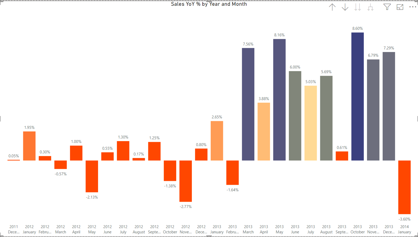
In this section I explain how easily you can conditionally format clustered column chart.
- Place a Clustered Column Chart on a page in Power BI Desktop
- Put “Year” and “Month” on Axis
- Put “Sales YoY %” on Value
- Click “Format” tab from “Visualisation” pane
- Expand “Data Colour”
- Hover over “Default Colour” then click ellipsis button
- Click “Conditional Formatting”
- Select “Field Value” from “Fromat by” drop down list
- Select “Sales YoY % Colour” measure then click OK

This is what we get:
Here is the full report I shared with you to try:
You can download the PBIX file here.
Have you used this technique? Are you using other techniques? I’d love to hear and learn from you, so leave your comments below.
Discover more from BI Insight
Subscribe to get the latest posts sent to your email.
Amazing!!!! thanks a lot!!!
I’m looking for a catalog of color names. Please tell me where to find.
Hi there,
Welcome to BIInsight.com.
That’s indeed an excellent question.
Chris Webb wrote blogpost about it in 2018 which answers your question.
Cheers.